The hotel business is not an easy one. A good owner must be able to organise a complete environment to which the customer wants to return again and again. This applies to cleanliness, smells, comfort and quality of the cuisine as well as to the interior.
A traveller who wants to stay overnight will obviously compare the conditions based on photos and reviews in at least a few places. Trust a marketer – far from always his choice will be made only on the basis of low price.
Any professional marketer is ready to prove on facts that a good interior really pays off and allows you to earn good money. And a hotel owner’s investment in quality design is necessary to stand out in the market. Today I want to tell you about how a designer, whose name I do not know, managed to create a thematic interior, which stands out as a pearl among faceless hotels. I want to write about this hotel, and I am sure you will want to come back to it.
On the example of one of the hotels that came my way, I want to talk about how to create a good impression on the guest with the help of the interior. How to make the guest want to share their opinion with other people and attract new guests for the hotel owner. And positive feedback is the foundation of a successful business.
So, meet Parkhotel Bielefeld with Milser Krug restaurant, which is located in a historical building in Bielefeld, Germany. The hotel’s website unfortunately has very little information in English, prepared as PDF. Probably a testament to the small number of international guests. But the German page details the history of the family and the hotel itself.
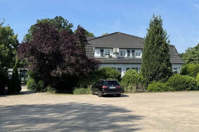
But our interest from the guest’s point of view is the interior, which greets the entrant and sets the general mood. The first few minutes of the hotel’s reception will determine how the guest feels about the hotel and whether they will want to stay in the lobby for a beer or whether they will decide to go straight to their room. And in the hotel lobby one wants to stay longer.
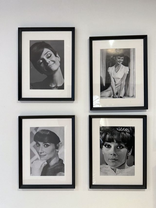
The hotel interior contains historical and classic furniture, photos of actors from the fifties. You can see that the owners clearly love the atmosphere of this time and decided to preserve its breath in their hotel.
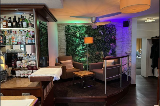
I checked in quite late in the evening and the reception greeted me with bright colours. The designer had used his skills of the light arrangement to his heart’s content and the owners had let him loose. You can see the result on the photos – everything was chosen very professionally.
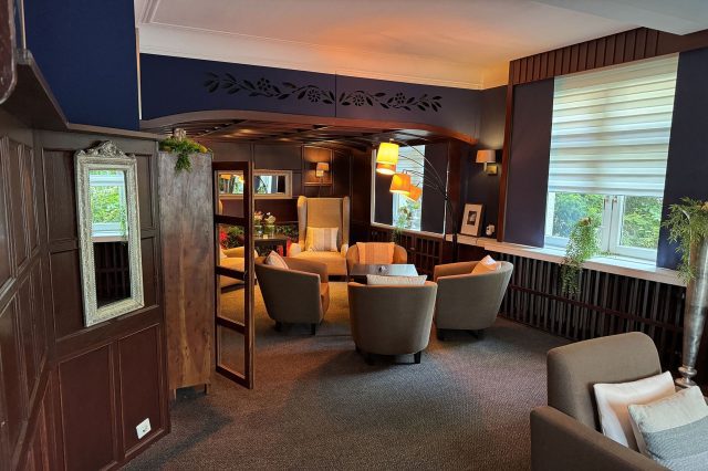
There are several cosy waiting areas next to the reception, which designers rarely give importance to. And for good reason. Take a look at the result. I noticed that all the colours of the furniture, walls, phytowall and light bulbs were carefully selected by designer using the Itten circle.
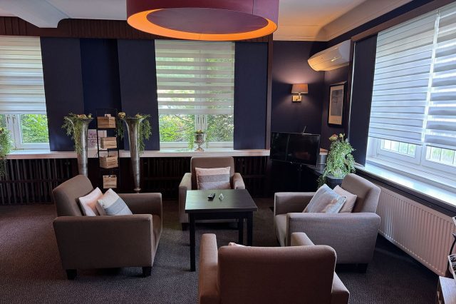
On the left side of the reception there is a breakfast area. In the lobby a diffused yellowish light from a huge lamp is used, which harmonises very interestingly with the dark blue colour of the walls.
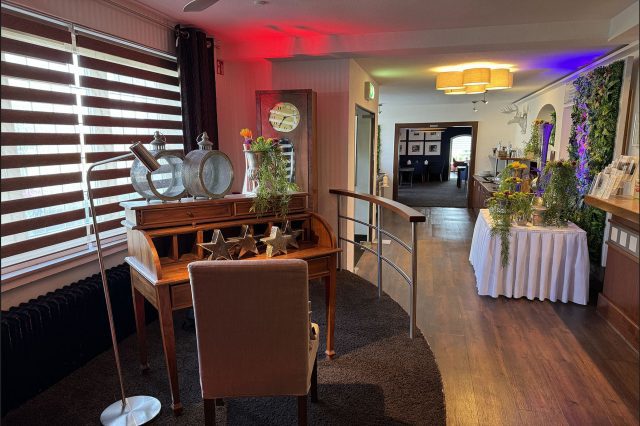
In some areas, light accents are again used with purple, yellow lamps, which create fanciful shades on the objects.
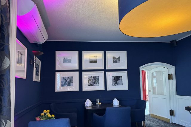
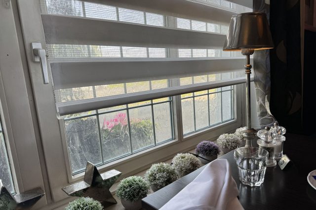
A great deal of importance has also been given to decoration. This is what the window in the breakfast room looks like.
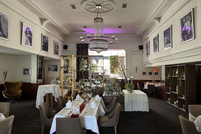
From the same room, there is an entrance to the central hall of the restaurant. It’s done in a grand style, with an emphasis on the classic styles of the first half of the twentieth century – our favourite style.
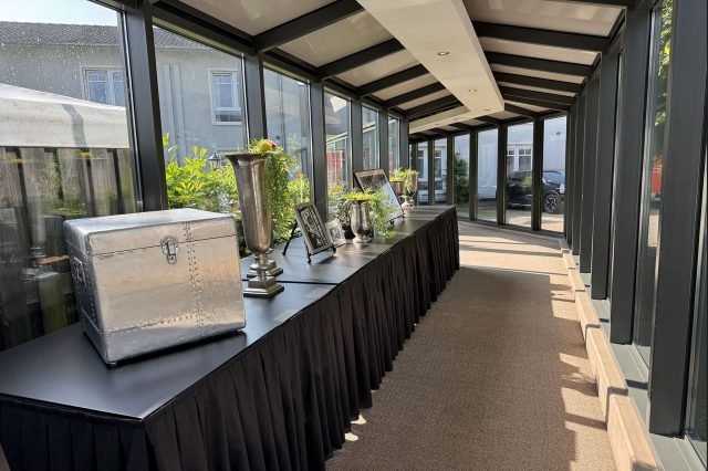
I got a room in the neighbouring building, which is connected to the restaurant by a long glass gallery. I would like to mention once again the designer’s skill: in order not to make the corridor look like a dull pipe, he changes the direction several times, and at each corner something new awaits the visitor.
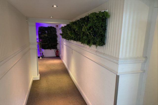
Passing through the gallery, the visitor moves from one era to another.
A visitor pays attention to the fact that everywhere there are photos of famous actors of the mid-twentieth century – from Audrey Hepburn to Roger Moore. And these photos correspond to the mood of the interior.
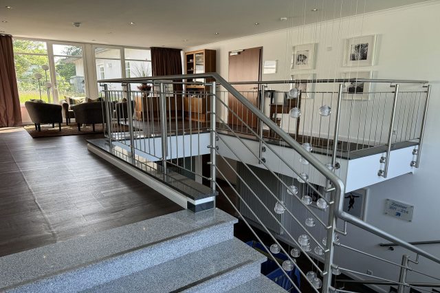
The neighbouring building has a completely different style, which appeals to the mid-century modern. A bubble lamp hanging from the ceiling, leather armchairs and vintage furniture are reminiscent of Mies van den Rohe’s creations.
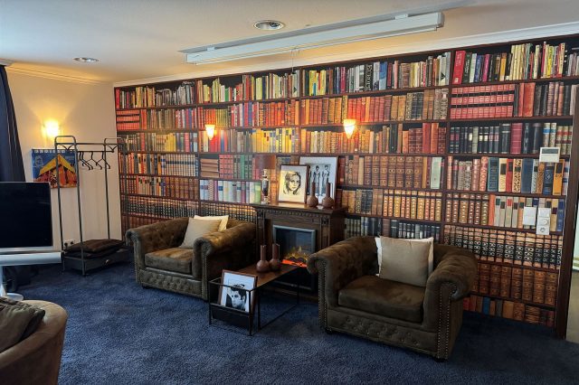
To keep the guest occupied, the designer has organised an incredibly cosy library. I don’t know how much the photos can convey the feeling of this place, but you really want to sit in a chair with a book and not have anyone disturb the silence of this spacious room.
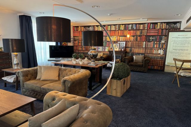
Here is one more picture of the library.
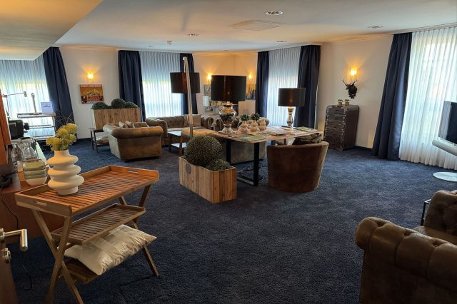
And this is its centrepiece.
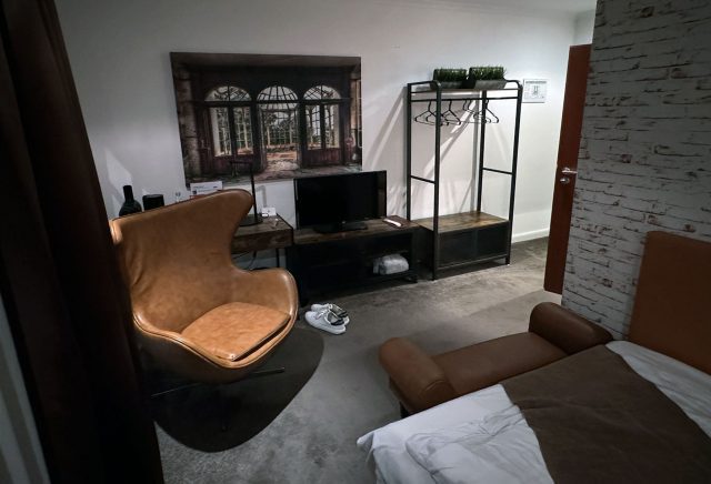
As I was only staying for one night, I got a small room, which is nevertheless very cosy. Next to the door, instead of the usual general light button, there is a touch button which changes the brightness of the lights. Of the problems I can mention only the inability to switch off the light from the sleeping area.
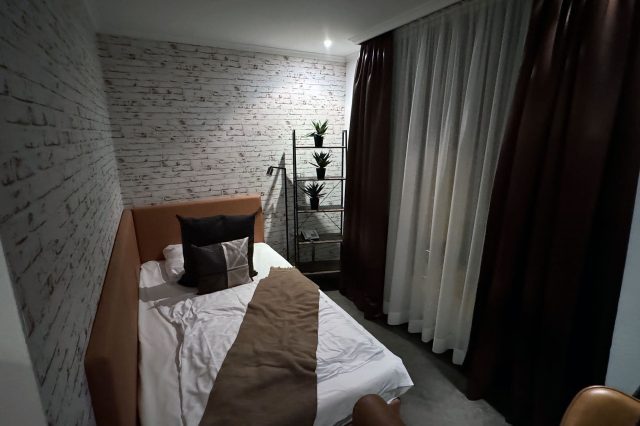
The interior of the room is truly homey. The designer paid a lot of attention to the decoration of the room. The colour combination of brown leather, black and white is very successful.
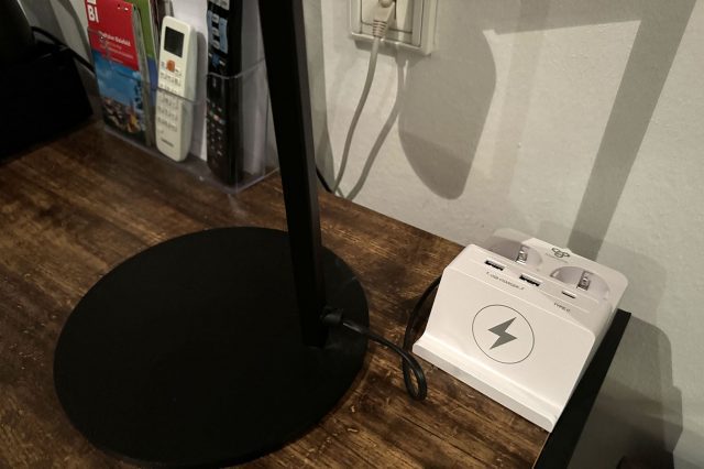
On the table there is a lamp and a charger for all sorts of gadgets.
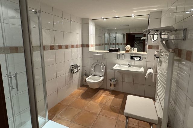
The website states that all rooms in the hotel are individually designed. My bathroom was like this.
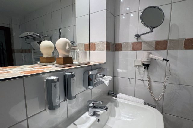
I would like to note that the owners do not skimp on the comfort of their guests: the bathroom offers not the cheapest shower gels made by Bogner.
Every person is a traveller from time to time. And it is especially nice when a hotel host does everything possible to make a guest feel at home. Unfortunately, I didn’t manage to appreciate the quality of cuisine in the restaurant as I checked in rather late, but I hope to do it in the future. This is one of the few hotels that really deserves my high praise as a frequent traveller.


