Many people think that the work of an interior designer is a simple selection of interior colours, and anyone can cope with it. However, the choice of colour is far from the first stage of the designer’s activity.
To change the space, a professional designer must have serious knowledge in repair, construction of buildings of different years of production. Even if the project is done remotely, many things have to be constantly clarified.
Let’s see how a designer’s work really looks like, on the example of our project for a young man who got a flat, at the sight of which the hands are down.
A time capsule from the ‘60s
Our client bought a neglected flat – ‘chruśczówka’ on the ground floor of a five-storey block of flats built in the early 1960s.
The flat was inhabited by elderly people who were unable to make decent repairs. The layout of the flat corresponded to the requirements of the last century, when there were not many electrical appliances in the flat. There was not even space for a washing machine.
In addition, the housing had many hidden problems. Even more than one could imagine at first glance.
Firstly, the walls were made of panels that could not be moved. The width of the rooms cannot be changed. It is allowed to remove partitions that are not load-bearing, but there are few of them in the flat.
Between the entrance hall and the living room there is a small cupboard made of fibreboard, and above the doors there are mezzanines for storing household utensils.
The floors are made of wooden boards, but in the 70s the owner got parquet somewhere, which was laid directly on the boards in the living room.
The bathroom was just awful. But for the eighties, these tiles and a rusty bathtub were the norm in the Soviet Union.
In short, there was a lot of work to be done. How to make a modern attractive interior out of a neglected babushatnik? First of all, we had to think about the layout of the flat.
Kitchen
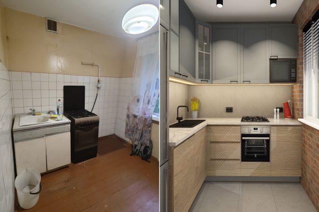
This is a kitchen in an old panel house built during the socialist era in the 1960s. The kitchen had a separate entrance and was only 5 square metres in size.
In a panel house, it is impossible to demolish the entire panel because it is load-bearing. We found a way to remove part of the partition, opening up the kitchen towards the living room.
Living room
This wall we removed. In order not to compromise the load-bearing capacity of the panel, we left the top beam. We got the documents for this renovation.According to the requirements, a kitchen with a gas cooker must have lockable doors. We designed glass sliding partitions, thereby visually maximising the space.

We kept the windows as the replacement was literally a couple of years ago. To improve the ergonomics in the bedroom, we moved the door, which is now visible in the picture.
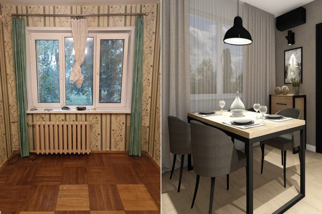
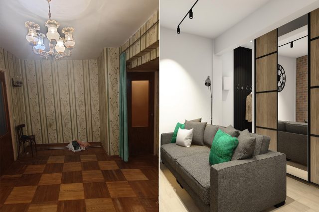
We have removed the wooden cupboard and in its place is now a direct passage from the corridor to the living room. In place of the old corridor leading to the kitchen, there is now space for a cupboard with sliding doors.
Bathroom
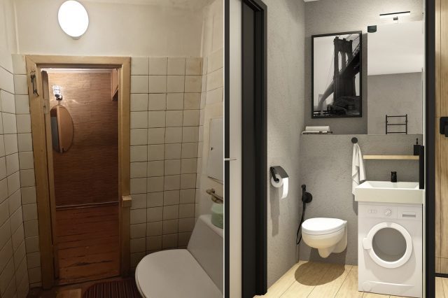
The bathroom looked just fatal. The previous owner had done renovations in the mid 70’s. What it had seen, this bathroom…..
We redesigned the room, finding space for a washing machine and a compact washbasin. The owner wanted a shower cubicle and he got it. The access to the meter and valves is decorated with a painting.
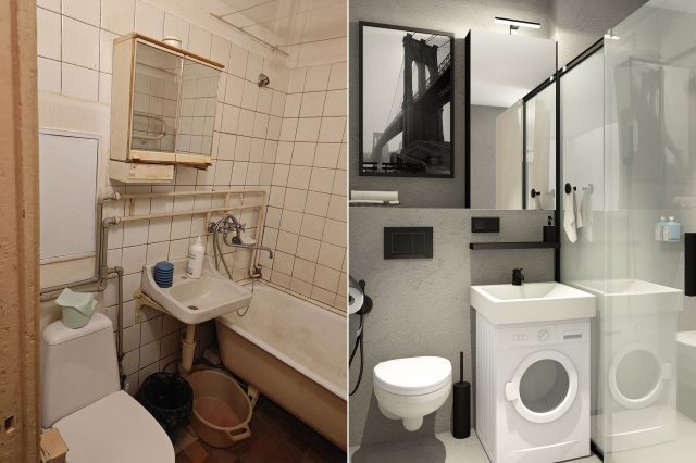
At the customer’s request, we used a material called ‘microcement’, which blended in well with our American loft. We selected the doors so that they look spectacular on both sides.
Hallway
The 60’s designers separated the entrance hall from the living room with a wooden partition. The wooden wardrobe was installed on the opposite side.
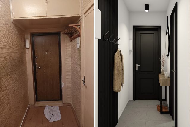
After we moved the main entrance, directly from the hallway you can access the living room through where the wardrobe used to be. But where to store things? Where there used to be a passageway to the kitchen!
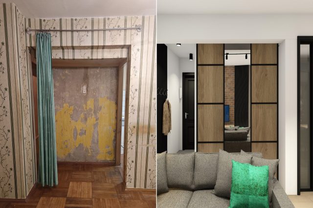
Bedroom
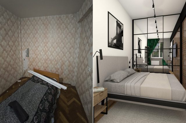
The bedroom has a complex shape: 2.5 metres wide by 5.5 metres long. After much thought and ergonomic evaluation, it was decided to move the door into the living room.
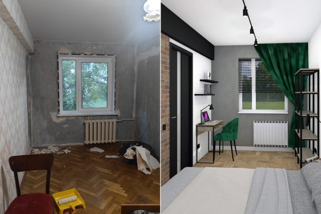
In this case we have room for a wardrobe, a wide bed and even a work corner by the window. The picture doesn’t show it, but we even have room for a suspended TV set!
All 3D visualisations can be found in our portfolio. And if you need to make your interior attractive, just click on the green button on the right side and message us on WhatsApp.
(C) All rights reserved.


